What Is The Best Cinematic LUT
Thinking about what is the best cinematic LUT? Here is a list of cinematic LUTs suiting best for your project!
7 min read

João Homem
Last updated: 12/8/2024
LUTs
What Is The Best Cinematic LUT For Your Project
Accessing LUTs has become easier than ever. However, finding the right LUT to match your visual style can still be challenging. You might be wondering: what is the best cinematic LUT to achieve stunning visuals?
The short answer… There is no one LUT to rule them all. But, there are many LUTs that will give you beautiful and clean results when used in the correct context.
If you’re unfamiliar with LUTs (Look Up Tables), think of them as powerful filters that can instantly transform footage with either a creative look, a color space transform or both. With countless options available, choosing the ideal one that fits your workflow can feel overwhelming. Fear not, we’re here to guide you through this process!
Meet Our Cinematic LUT
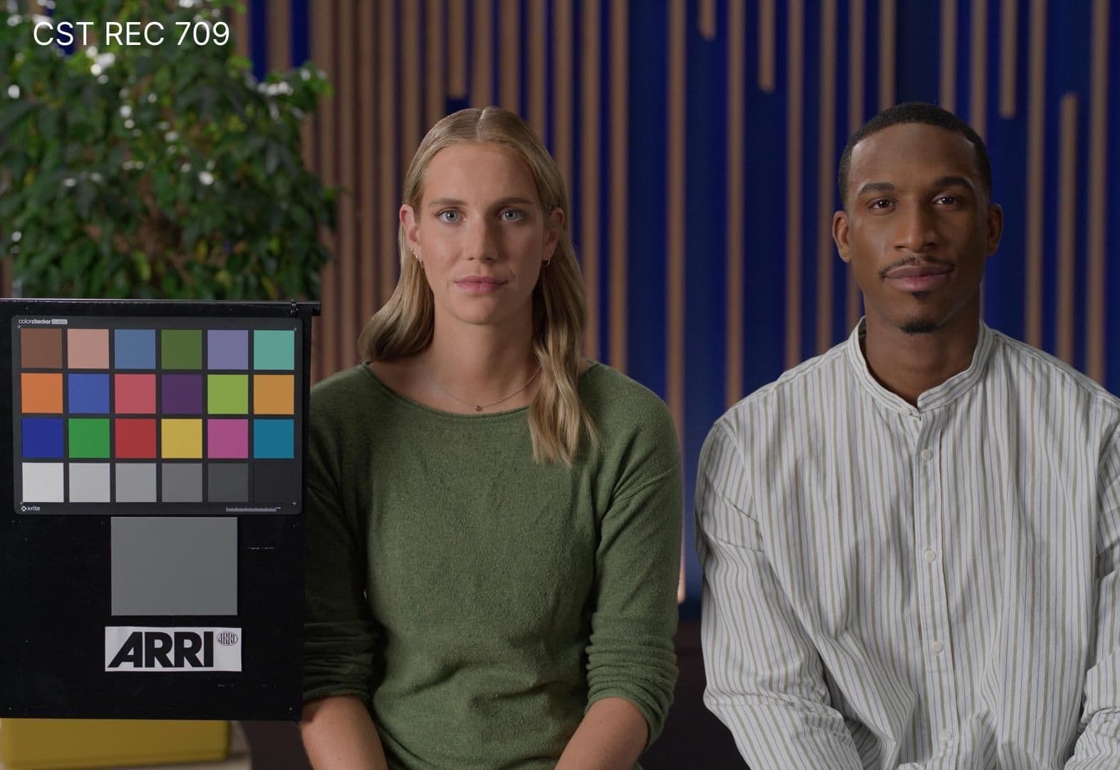
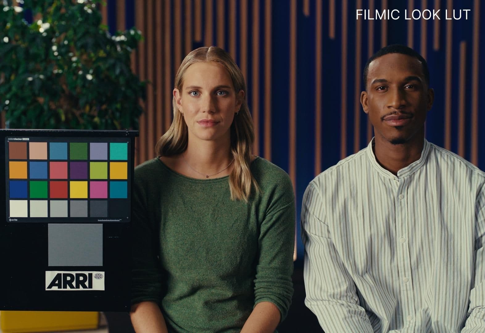
Introducing our Filmic LUT, thoughtfully designed to bring a cinematic touch to your footage. This LUT is a creative conversion LUT - meaning, it’s a LUT that is intended to convert your LOG footage (a scene referred space) to Rec 709 gamma 2.4 (a display referred space) with a creative look baked into it.
What is a Creative Look?
A creative look is exactly what it sounds, a set of choices and decisions made within a certain context that results in an altered image with creative bias. For example, our Filmic Look LUT is inspired from a mix of the color palette found in Kodak 250D film stock combined with a softer take on 2383 Film Print’s contrast curve.
Together, they convey a nostalgic feel, with deep blacks and soft rolled off highlights, making this LUT suitable for those chasing for that organic look found on celluloid.
So What Makes a LUT Cinematic?
First, let's break down what cinematic actually means.
“The term cinematic refers to anything that evokes the qualities, techniques, or aesthetics associated with cinema (motion pictures). It often implies a visually engaging, emotionally impactful, and narratively compelling experience that mimics the feel of professional filmmaking.”
Visually Engaging Look
What makes an image visually engaging is never just one specific thing but a combination of all the elements that compose that image, falling together in harmony. Composition, balance, light, shadows, contrast and color just to name a few.
Let’s take a deeper dive into how a visually engaging look is built within color grading:
Contrast
Contrast is the foundation of any look. A good way to visualize contrast is to picture its curve. For example: Here’s a strong and bold contrast curve on the left and a softer compressed contrast curve on the right.
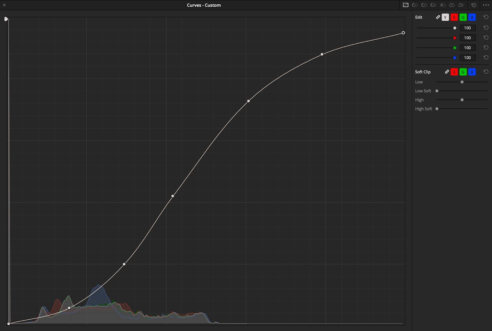
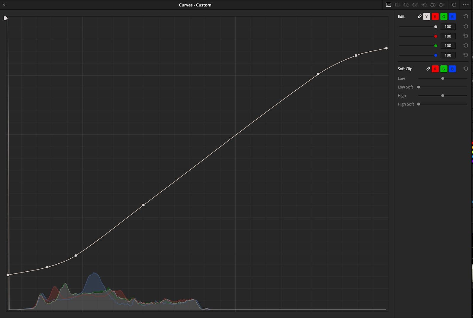
And here are some visual representations of strong and soft contrast:
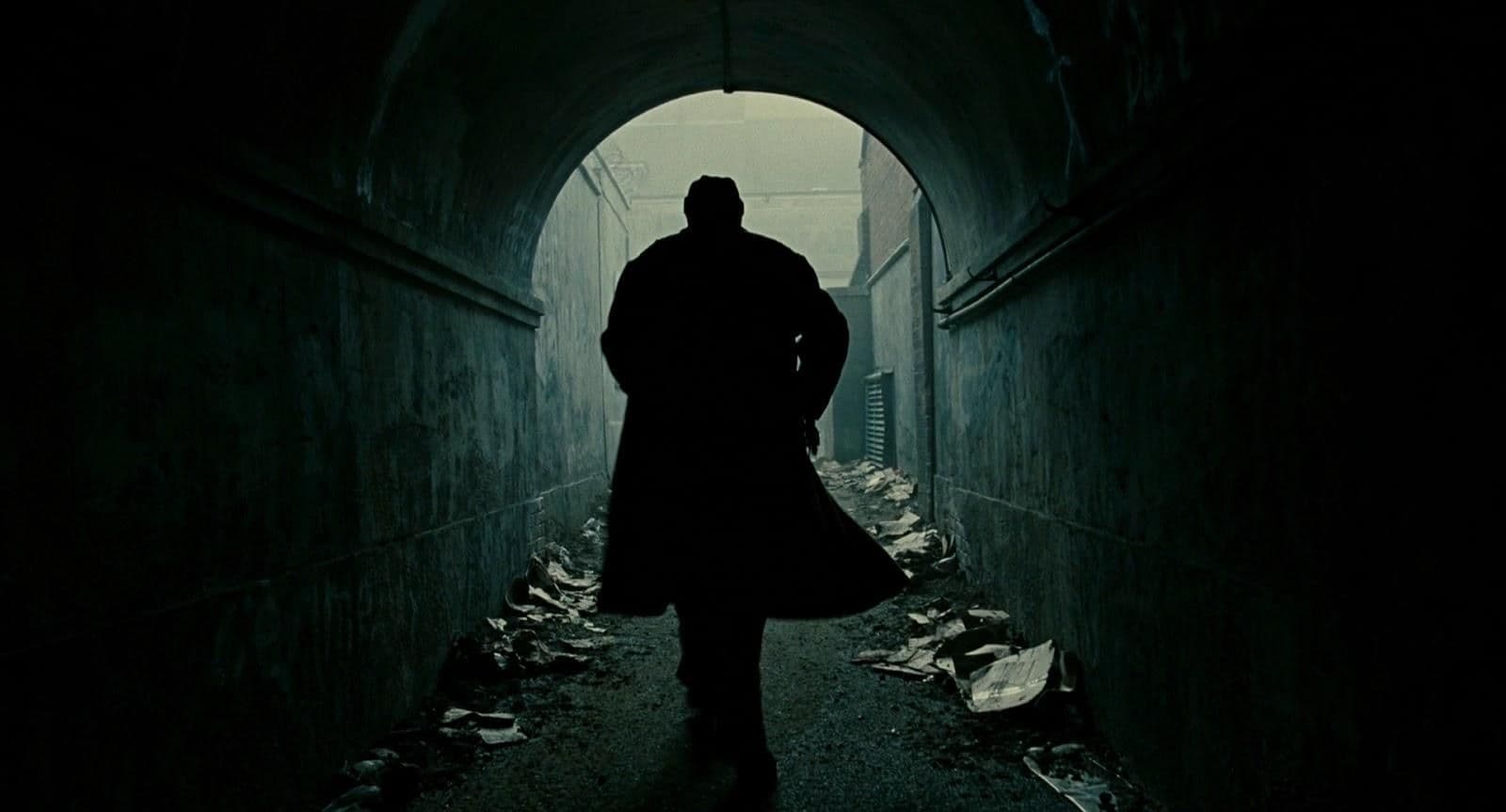
Children of Men: By Cinematographer Emmanuel Lubezki & Colorist Steven J. Scott - a beautiful example of strong contrast with deep inky blacks.
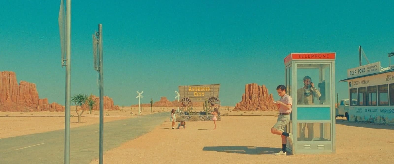
Asteroid City: By Cinematographer Robert D. Yeoman & Colorist Gareth Spensley - an example of very compressed and soft contrast, notice how the blacks feel very lifted and faded.
An engaging contrast curve is really subjective. It depends on the world and vibe you’re looking to create and how it fits the mood of the project. A strong bold curve can often look beautiful and pop really well but if used in the wrong context it can become the opposite of cinematic and feel overdone.
Color
Color is a very broad term, but what does cinematic color actually mean?
Often when someone is talking about a movie and refers to its colors as cinematic - what they actually mean is the choice of color palette used on that specific film evokes an emotional response from them that deepens their subconscious connection to that artform.
Keyword being the choice of color and sometimes lack of it. One of the key responsibilities of a colorist and cinematographer is to make creative decisions of what colors they want to include and exclude from their palette in a given project. A harmonious palette often has less colors in it and is restricted to certain tonalities. However, like most rules in filmmaking they often are and should be broken.
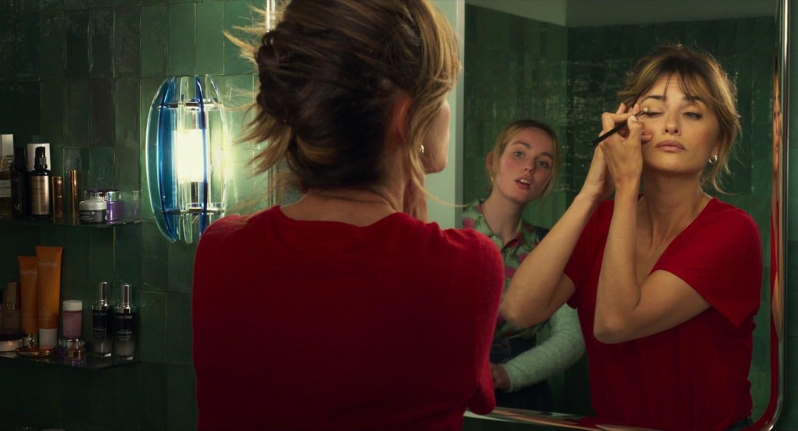
Parallel Mothers: By Cinematographer José Luiz Alcaine & Colorists Chema Alba & David Taranilla - An example of deep, rich & saturated colors.
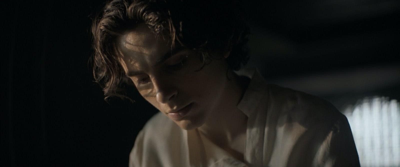
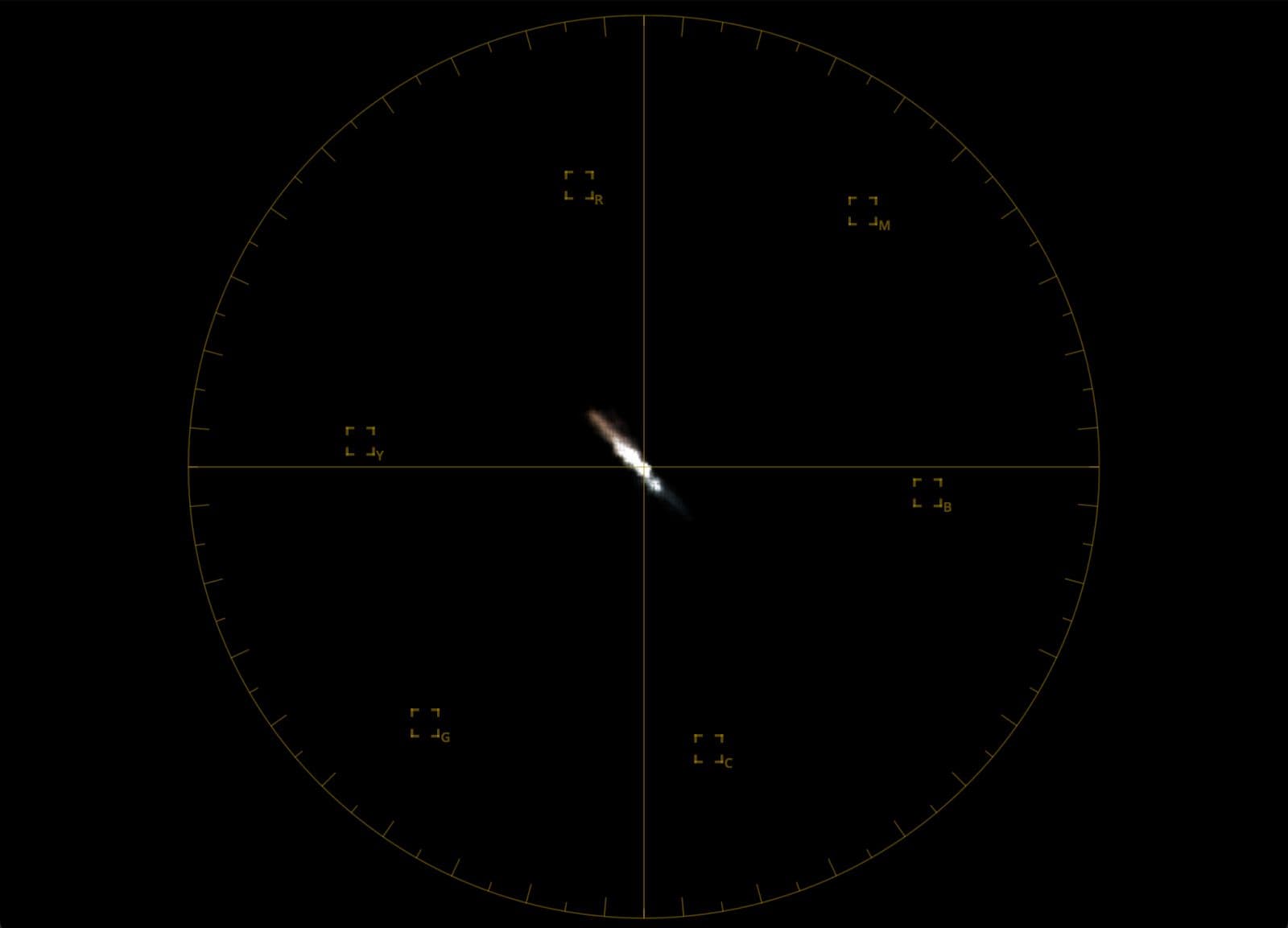
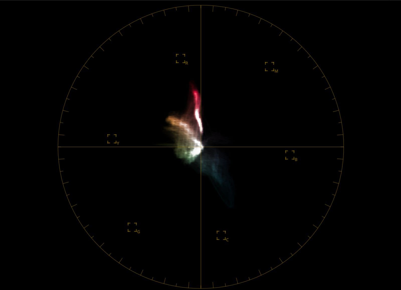
Dune: By Cinematographer Greig Fraser & Colourist David Cole - A muted and monochromatic color palette.
So how would you go about creating a color palette on your footage? It all starts in pre-production, when the Director, Cinematographer and Production Designer as well as an Art Director all agree on a vision and mood for the project. However, since we often don’t have access to big budgets, crews and properly controlled environments for our films, we have to make due with the limitations we have - which sometimes can actually be positive.
For now, let's focus on color in post production and in the context of a Creative Look:
There are many ways of dialing in a color palette into a look. Everything from LUTs to operations like Lift, Gamma, Gain or HUE vs HUE, HUE vs SAT, and many more. Let's look at the palette of our Filmic Look as an example:
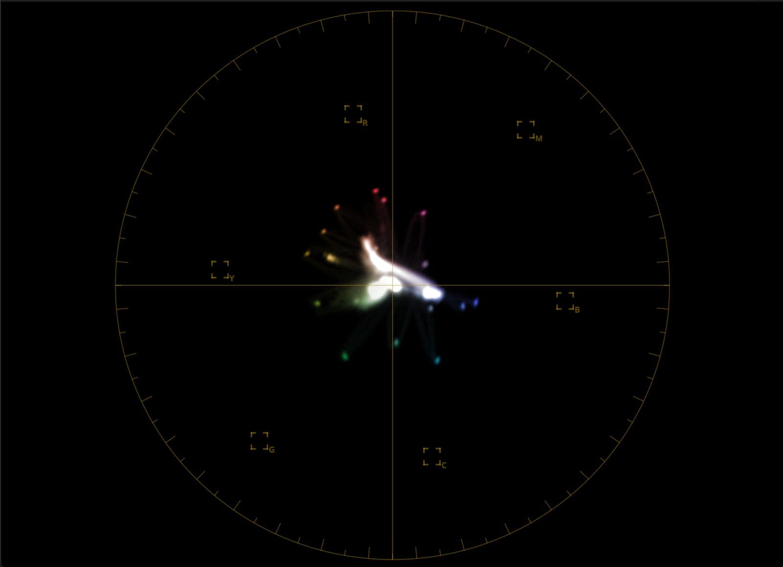
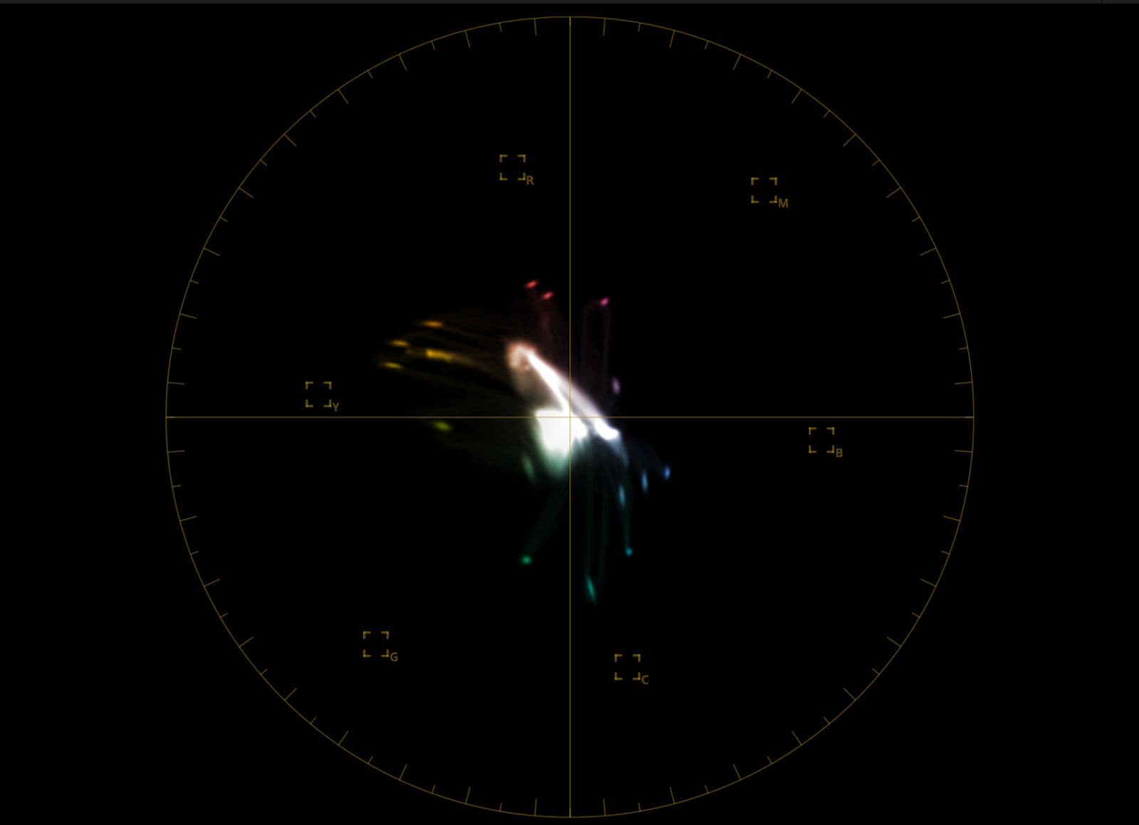
On the left, we have a basic Color Space Transform to Rec 709 in Davinci Resolve and on the right our Filmic Look LUT, both being applied on the same Arri test chart image. Notice how the LUT warps colors to achieve different tones all throughout the vectorscope, some more saturated like the reds and yellows while green and blue maintain a less saturated profile. This is one of many ways a color palette is built. A colorist chooses which colors he wants to accent and which ones he wants to mute or twist into a different hue.
*If you’ve never seen a vectorscope - It’s a graph that maps the color information of an image in terms of hue and saturation. The center represents neutral tones (black, white, and gray), while the outer edges indicate highly saturated colors. The direction corresponds to specific hues (e.g., red at the 3 o’clock position, cyan at 9 o’clock), and the distance from the center shows saturation intensity.
How to tell if a LUT is reliable?
There are many ways to stress test a LUT, everything from color charts, to looking at in a 3D cube. Here are some ways you can test your LUTs to make sure they’re reliable.
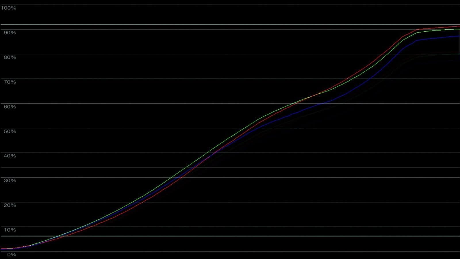
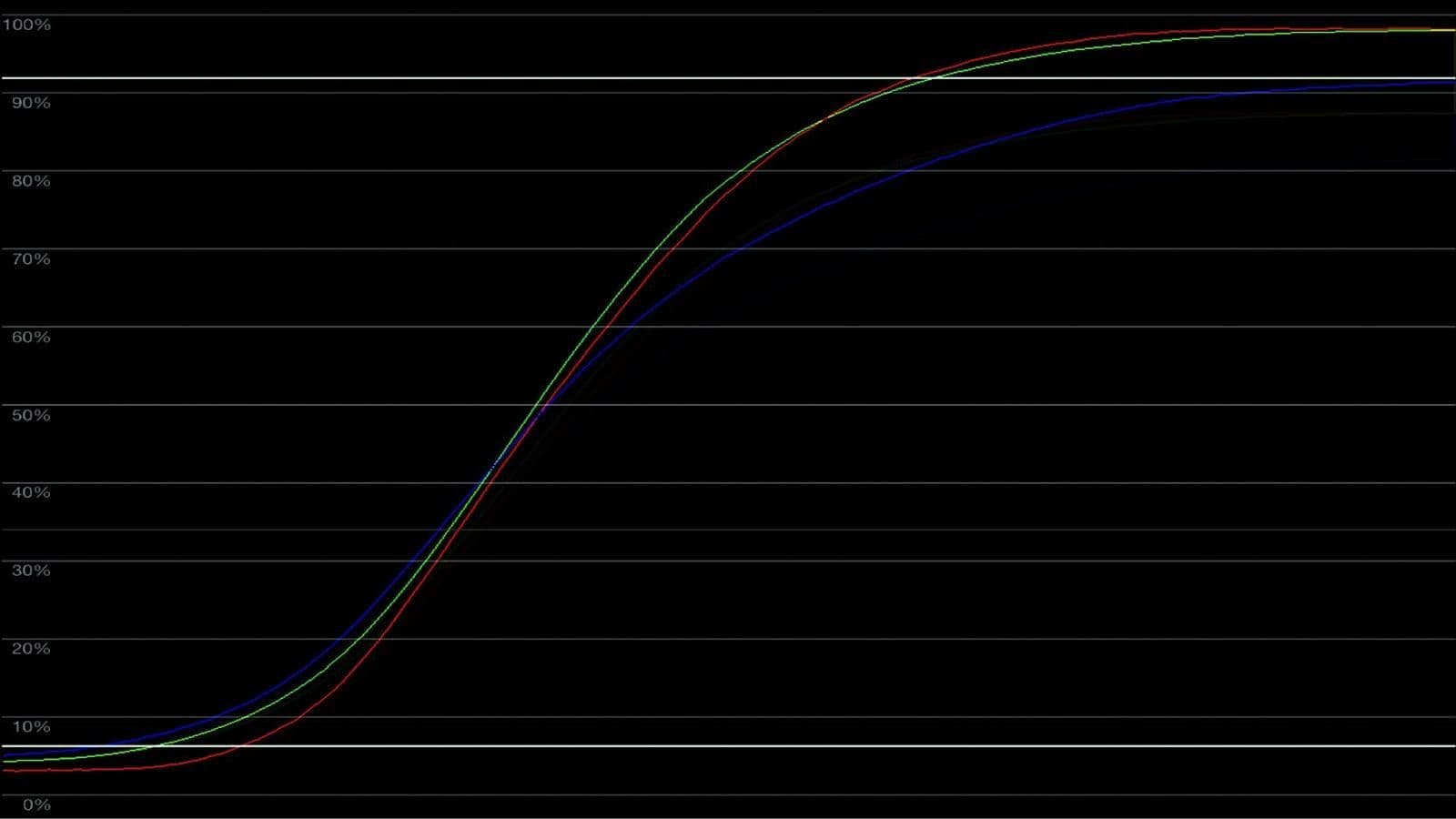
- Using an exposure ramp: This is a simple gradient that goes from pure black to pure white. When you apply a LUT to that gradient you can read its curve on the waveform to understand what it's doing to each RGB channel
On the left we have a LUT found on the internet that will likely cause artefacts and unwanted results. Notice how the curve is bumpy and there is no retention of middle grey. On the right we have the Cromatic Filmic LUT, and you can see a clean soft curve with a preserved middle grey point.
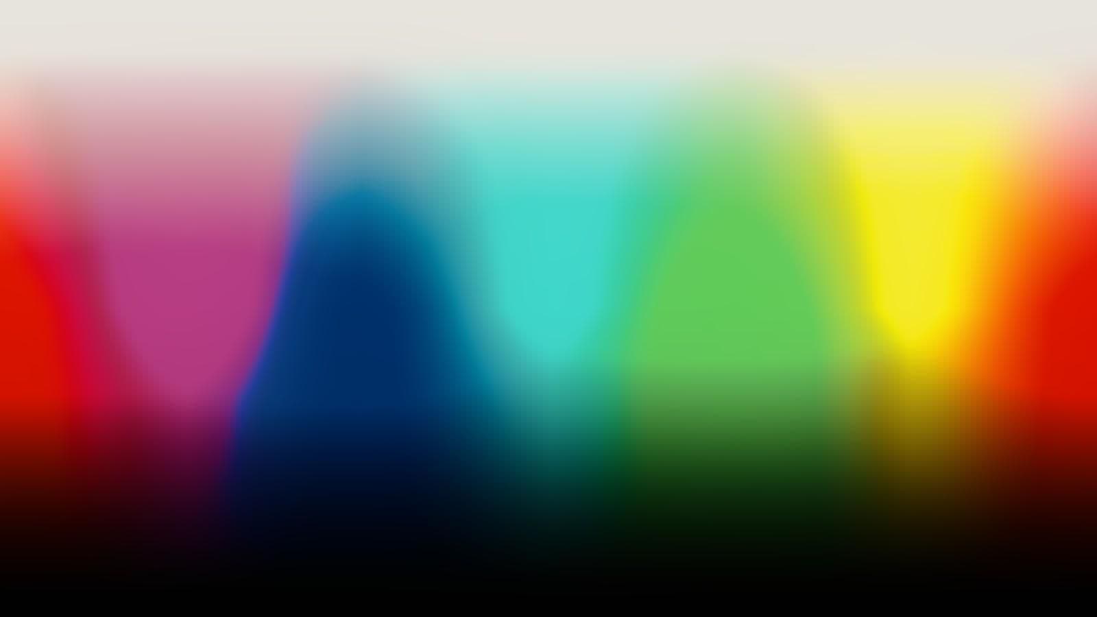
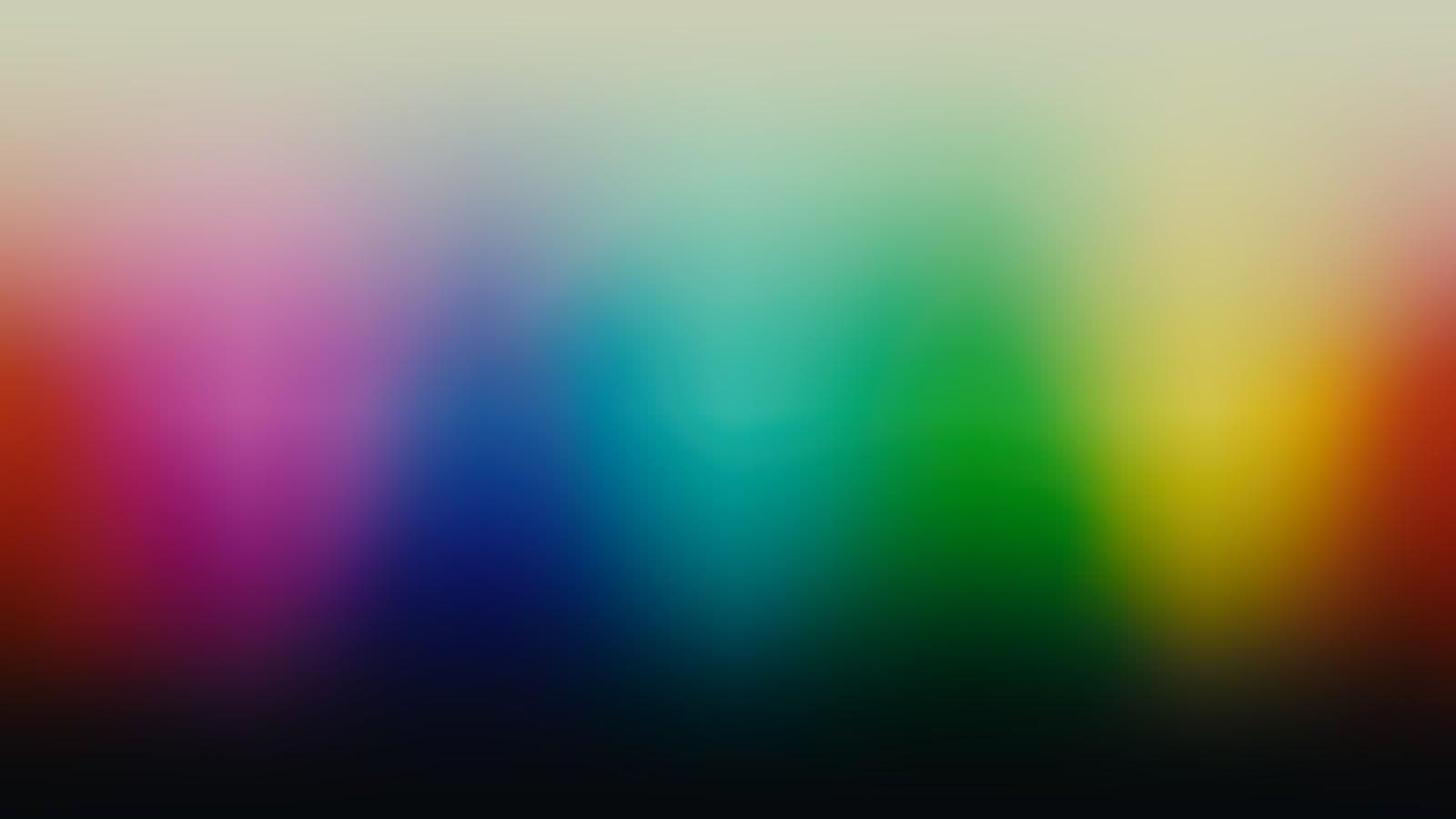
2. Testing it against a color gradient: On the left you’ll notice blotches and an abrupt shift between hues, a good sign that a LUT will cause artefacts on your footage. In comparison, our LUT on the right image maintains a smooth color gradient throughout.
3. Looking at its 3D Cube: Another more advanced way to better understand what a LUT is doing is to examine its 3D histogram or 3D cube, but that will be a more complex topic for another article.
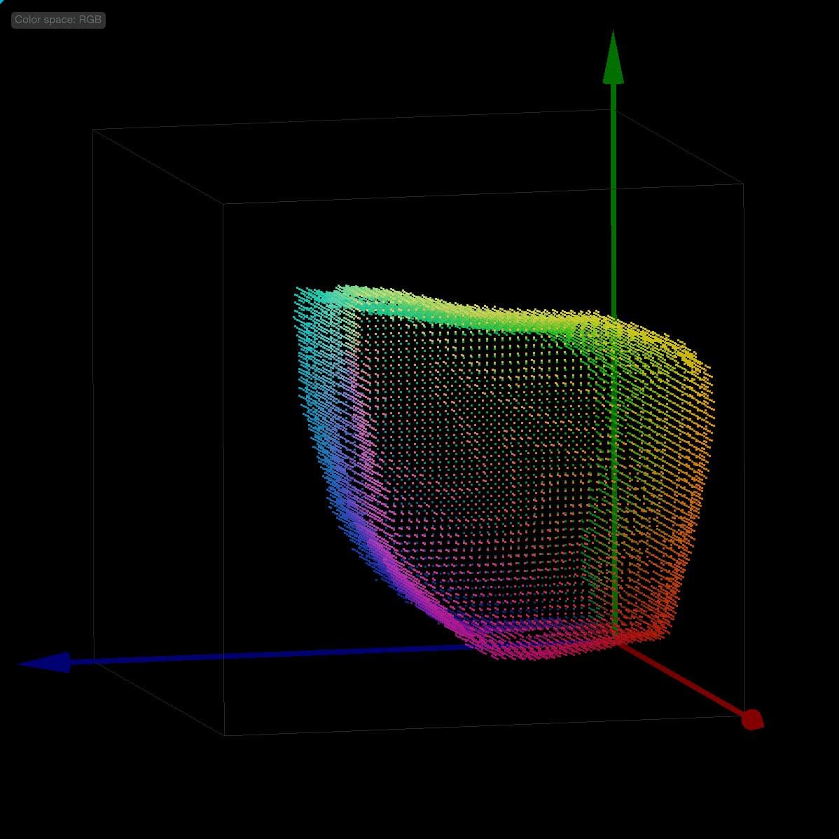
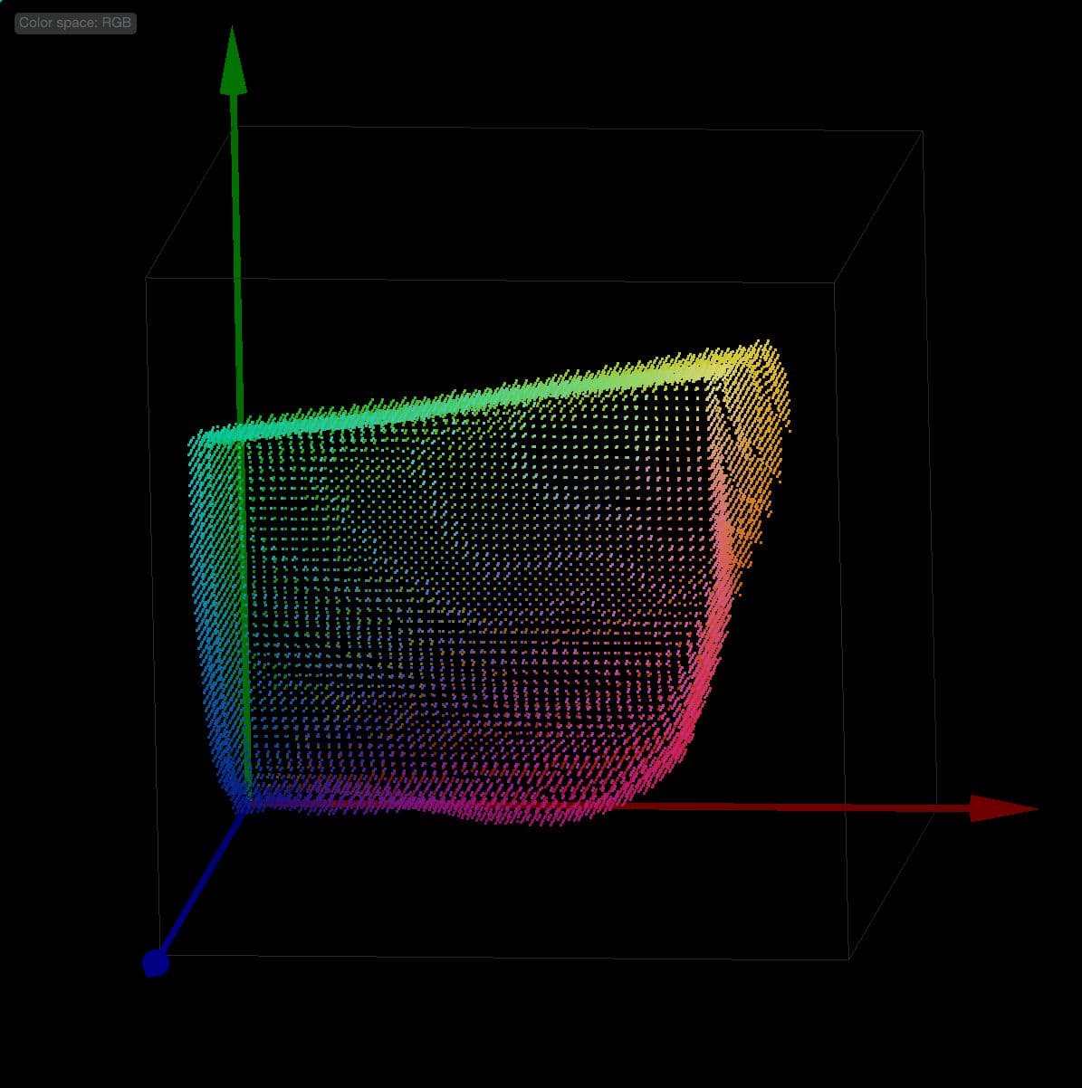
Here are two videos that detail the process of stress testing a LUT:
Closing thoughts
More than choosing the right LUT, understanding the choices behind that LUT can be a transformative step in elevating the look and feel of your project. While no single LUT can claim to be the ultimate solution, understanding the principles behind cinematic aesthetics—contrast, color palette, and creative intent—will empower you to make informed decisions that are guaranteed to level up your filmmaking. Lastly, feel free to take a look at our latest article, What is a LUT, where we explore some of the principles behind a LUT.